
Tuesday, 20 December 2011
Gerhard Richter Retrospective // Tate Modern
I've been a fan of Richter for a while now but hadn't seen any of his painting in real life. I'd admired his technical skill and the subtlety in which he tackles quite profound and complex topics.

I loved this painting. I'd seen it online and wasn't that impressed but it was stunning in real life. It's the first painting I've seen and been extremely conscious of the physical movement of my eyes looking across the canvas . The immediate connotation is that of pixels and it made me think of the immense amount of constructed visual imagery that surrounds us now. It was that feeling of being overwhelmed that I almost felt physically through my awareness of the erratic movement of my eyes attempting to process it all.
Sunday, 18 December 2011
George Condo // The Hayward // London
I'm not a big fan of George Condo's work, though I do like his use of humour and appreciate the homage to european portraiture that his work presents to us. I also found it interesting walking round and thinking about why these portraits were lighthearted, satirical humour and a mockery rather than the profound reflections of the human condition that the work he borrows from is received as. What is it about the visual language that defines these charicatures as comic and cartoonish?

One set of work was displayed on the wall in a traditional layout of portraits in a museum, house or gallery, something like a dysfunctional family.
I suppose these paintings make you look at those historical european portraits with fresh eyes, and with more awareness of the visual language they use.

I suppose these paintings make you look at those historical european portraits with fresh eyes, and with more awareness of the visual language they use.
Thursday, 15 December 2011
Collection
These are some of the places, things and artists that are influencing my current project, starting from the idea of collecting and journeys. I've started by looking at the areas and structures that are ubiquitous with UK suburbia; the places in which the majority live and spend our lives. It came from looking at the surroundings of the journeys that I take everyday.
John Myers : Middle England
I went to see John Myer's exhibition at the Ikon in Birmingham this week. His photographs tie in directly with what I'm looking at at the moment and some of them had quite a striking presence.
The exhibition displayed his photos of 1970's Stourbridge. There were some interesting portraits but the ones I was interested in were void of humans and human interaction. These ones make us look again at the surroundings in which we live in. In an interview he says that his work is partly about "coming to terms with the place we live in" as opposed to desiring and lusting after the spectacular and picturesque.

Richard Gaplin: Collages inspired by architecture
Using photographs that are cut extremely precisely Gaplin recreates spaces.
This top piece is an earlier piece of his work, less abstracted and related more to the original space.


The one above, 'BRACE VI (Braston)' loses almost all resemblance to a reality, only recomposing some memorable aspects. The effect is an image of a seemingly futuristic and utopian city.
I'm more interested in the taking of photos, editing out and recomposing the space in relation to an idea of mental/emotional response to it.
 |
 |
| George Shaw |
John Myers : Middle England
I went to see John Myer's exhibition at the Ikon in Birmingham this week. His photographs tie in directly with what I'm looking at at the moment and some of them had quite a striking presence.
The exhibition displayed his photos of 1970's Stourbridge. There were some interesting portraits but the ones I was interested in were void of humans and human interaction. These ones make us look again at the surroundings in which we live in. In an interview he says that his work is partly about "coming to terms with the place we live in" as opposed to desiring and lusting after the spectacular and picturesque.

Richard Gaplin: Collages inspired by architecture
Using photographs that are cut extremely precisely Gaplin recreates spaces.
This top piece is an earlier piece of his work, less abstracted and related more to the original space.


I'm more interested in the taking of photos, editing out and recomposing the space in relation to an idea of mental/emotional response to it.
Marbling
I love these marbled prints. The patterns and colours are hypnotic. The lines in this one also links in with my previous post. It was surprising to me that they're actually mainly from the 19th century, they look so much like the designs and art being created in the mid 20th century.


You can see more here. It's also generally a very good website for posting series of beautiful and unusual images.
15/12/11


This started as a college project but I wanted to continue it and merge it with things I've been interested in recently, including mapping.
These are just rough results of thought processes. Hopefully I'll have time to develop them to a better thought through and polished work. I was interested in the simplistic symbols and the way that they kind of relate to my simplistic understanding of a time that collates a mass amount of history, cultures and values.


- Placing yourself in history -
The images above are collages I did on photoshop made up of photos of my tights. Bit strange, but I found that when stretched around my leg the fabric created these lines similar to a topographical map. They're very rough but it was more to experiment with what effects I could create. The blue one has been printed and scratched into.
It made me think of artists I've been looking at recently that try to place themselves within history as well as process their heritage and comment on the way we engage and relate to it. The power and wealth of the country I live in (though still decreasing) is a remnant of that time of violent colonialism and as a result of chance of birthplace it is part of my heritage. Using the visible contours of my body might be an interesting way of exploring that idea, or perhaps other ideas to do with place and identity.
It made me think of artists I've been looking at recently that try to place themselves within history as well as process their heritage and comment on the way we engage and relate to it. The power and wealth of the country I live in (though still decreasing) is a remnant of that time of violent colonialism and as a result of chance of birthplace it is part of my heritage. Using the visible contours of my body might be an interesting way of exploring that idea, or perhaps other ideas to do with place and identity.
These are just rough results of thought processes. Hopefully I'll have time to develop them to a better thought through and polished work. I was interested in the simplistic symbols and the way that they kind of relate to my simplistic understanding of a time that collates a mass amount of history, cultures and values.


Colonial symbol and typographical map.

This drawing on fabric is part of the original project. A drawn collage of different colonial symbols.


Wednesday, 30 November 2011
http://www.frieze.com/issue/article/twenty-years-fore-aft/
I liked this article in Frieze that describes what a future in 2013 might be like. It concentrates mainly on the impact technology has on our lives and what its developments might be in the future.
The images it used as visual reference were also really interesting. These maps by Eric Fisher are stunning visualisations ofsocial network activity going on across the world at particular moments. Orange dots are the location of flickr accounts, blue dots represent tweets and white dots are where both occur.

You can see a series of his work here: http://www.digitaltrends.com/mobile/stunning-maps-visualize-twitter-and-flickr-use/
Magazine Review // From a Distance
http://www.frieze.com/issue/article/from-a-distance/
I picked this article out as an example of the wider and challenging issues the magazine includes.
The article is a discussion about the role of big art institutions in responding to current social and political crisis, particularly in reference to the Arab uprising this year.
It highlights the complexities of dealing with current events and the awkward balance of politics in art.
The point in the article that came over strongest to me was the idea that institutions that are distant from these events are at risk of curating work that distances the audiences even further because of the traits art tends to have in monumentalizing, sensationalising and historicizing reality. Or, becoming detatched from the reality by implementing it's own ideas and concepts onto these events.
The article also seems to question the balance between a completely apolitical art world and one that is self-congratulatory and conceited.

The article contained a photo of Imran Qureshi's installation 'Blessings Upon the Land of My Love', a very powerful installation at the Sharjah Biennial. The red stains are actually painted flower patterns, but have become a massacre on the courtyard floor; it's beautiful and horrific all in one.
Magazine // Freize
The magazine I chose to adopt is..


“frieze magazine was set up in 1991 and is the leading magazine of contemporary art and culture. frieze is published eight times a year and includes essays, reviews and columns by today’s most forward-thinking writers, artists and curators” Frieze website

Frieze’s demographic most likely consists of professionals within creative industries, predominantly fine art, as well as students and people with a high interest in the art world. Its articles are mainly about fine art, but they also include articles about other areas of culture such as music. Many articles also tackle wider issues such as politics, technology and ethics but normally basing it within a cultural context.
The magazine is heavy in gallery and exhibition adverts, but very little, if no adverts that are selling product based commerce.
Tuesday, 29 November 2011
Fine Art V.S Craft
After watching a documentary on Grayson Perry's new exhibition at college, we got into a discussion about what distinguishes fine art from craft.
Ai Wei Wei is an interesting artist to look at on this topic. Much of his most iconic work centres around ideas of Chinese traditions and the effect of capitalism on Chinese heritage, like the sunflower seeds in my previous post. More generally however, he looks at the way in which we value objects and our history and how the two are interlinked.
Ai Wei Wei is an interesting artist to look at on this topic. Much of his most iconic work centres around ideas of Chinese traditions and the effect of capitalism on Chinese heritage, like the sunflower seeds in my previous post. More generally however, he looks at the way in which we value objects and our history and how the two are interlinked.
 |
| 2006 |
These real ancient vases have been dipped in ready made, cheap paint, vandalising their image and their worth as ancient artefacts. He also makes his own ceramics; I remember seeing a video clip of him making huge urns, then when finished, he toppled them over and watched them shatter. He uses craft skills as a way to present ideas, the end product isn't the the most important aspect but the process.
 |
| Vase from ancient China 403-221 BC |
Monday, 28 November 2011
Summer Exhibitions // Tate Modern // Ai Weiwei

When I was in the Tate Modern, I had chance to look around the rest of the collection and found the remnants of Ai Weiwei's Sunflower Seeds that were in the turbine hall last year. I'd really wanted to go and see them when they were there but didn't have chance, however seeing them like this was still impressive. The way they've been poured into the centre of the room has the look of the industrial about it, which would mirror the ideas of mass production, industry and individual identity that the individual sunflower seeds, and the way that they were made, perhaps present.

History of My Life in 4 Objects
CHILDHOOD:

 This was my favourite toy for the first four or five years of my life. He was imaginatively named, 'Panda'. and is now very scraggy with a squashed nose.
 He was made in China the year I was born and retailed by Marks and Spencers.
EARLY TEENAGE:
 This is a locket I was given the day my sister was born. I lost it for a while but found it again when I was in my early teens.

 This is a memento I bought on my first holiday on my own with friends.
I've since tried to buy an equally tacky object each time I visit a new new city abroad. I have a blue glittery colluseum to go with it.
I picked it because
Surprisingly it doesn't say where it is made. I bought it from one of the many tourist shops selling all the same products.

I realised one object is meant to be an image, so here's one from the same time. It was taken by my friend on a Diana Camera. I only just recently saw it. I like that it has been made using a proper film camera and can't be easily reproduced and that it is a physical object.
It's from Bastille Day, watching the fireworks next to the river and drinking cheap beer.
PRESENT:
 Finally, this probably sums up my present.
It's a sketchbook from the past summer and my present and it generally goes with me everywhere.
Moleskine is apparently a successor to the notebooks used by legendary artists and writers of the last two centuries including Van Gogh and Picasso. It uses this as a selling point as a status symbol to people who consider themselves culturally aware and creative.

 This was my favourite toy for the first four or five years of my life. He was imaginatively named, 'Panda'. and is now very scraggy with a squashed nose.
 He was made in China the year I was born and retailed by Marks and Spencers.
 The origin of the Teddy Bear comes from Theodore (Teddy) Roosevelt. The popular story goes that that he was out hunting but became impatient and headed back to camp. His hosts went out and caught him a bear as a gesture to impress him but Roosevelt refused to shoot it because it was tied up. Journalists who were there made it into a national news story, accompanied by a satirical cartoon. Within a year the story and cartoon materialised into a toy bear for children and teddy bear has since become a childhood icon in for the a century.
EARLY TEENAGE:
 This is a locket I was given the day my sister was born. I lost it for a while but found it again when I was in my early teens.
There are no manufactured markings on it, but it was bought from a jewelry shop in my town.
The actual origin of the locket is unknown but they became very popular in the Victorian era. They were often used as a way of remembering someone who had recently died or as a symbol of love for someone, sometimes containing a lock of hair or a photo of a loved one.
LATE TEENAGE:

 This is a memento I bought on my first holiday on my own with friends.
I've since tried to buy an equally tacky object each time I visit a new new city abroad. I have a blue glittery colluseum to go with it.
I picked it because
Surprisingly it doesn't say where it is made. I bought it from one of the many tourist shops selling all the same products.

I realised one object is meant to be an image, so here's one from the same time. It was taken by my friend on a Diana Camera. I only just recently saw it. I like that it has been made using a proper film camera and can't be easily reproduced and that it is a physical object.
It's from Bastille Day, watching the fireworks next to the river and drinking cheap beer.
PRESENT:

It's a sketchbook from the past summer and my present and it generally goes with me everywhere.
Moleskine is apparently a successor to the notebooks used by legendary artists and writers of the last two centuries including Van Gogh and Picasso. It uses this as a selling point as a status symbol to people who consider themselves culturally aware and creative.
Summer Exhibitions // Tracey Emin's Retrospective // 'Love Is What You Want'

I was doubtful doubtful about Tracey Emin's art before this exhibition. Her reputation and celebrity often overshadows her work and what it's about.
I was surprised to find that I actually like a lot of it and was able to respond to it strongly. She is famous for saying that her art is her life and you got that idea very clearly in the exhibition.
Although her work is extremely personal to her, her pieces deal with themes and experiences that anybody would find easy to identify with; love, loss, grief, sexuality, identity, anger, bitterness, insecurity, alienation and more. The exhibition is a documentation of her life, and consequently perhaps almost a representation of the internal life of many others.
The wall hangings and neon lights were the most poignant for me. They consist of incredibly private thoughts conflicting with each other, ranging from angry and bitter to sentimental. They bluntly hit a nerve about the insecurities, fears and emotions tied with relationships and letting yourself become vulnerable to someone. They’re the thoughts I think that a lot people have at some point and it was very strange seeing them being shouted out on a gallery wall.

I didn't like all of the work though. She exploits the voyeuristic nature of our society and sometimes that becomes too crude. I felt uncomfortable reading her diary entries and thought that pushed the line too far about whether a person's life can be defined as art.
Summer Exhibitions // Che Guevara in Rome

When I was in Rome I came across a small exhibition trying to promote Che Guevara's photographic work. There's very little of it online, and none published in any books that I can find.
The exhibition was interesting because it presented you with a different, more human side to the revolutionary, whose image has been repeated continually for commercial purposes. His portrait is used on merchandise across the globe; t-shirts, mugs, towels, key rings, and more, so much so that the image has lost it's meaning, becoming more myth and narrative than a real slice of history.

The photos strip away that image, presenting what he saw, the people he met and the family he was part of. The fact that he was a major figure in 20th century history seems almost insignificant, just that he was a person living at that particular moment in time.
Summer Exhibitions // Miro Retrospective at Tate Modern
Before I went into the exhibition I didnt find Miro's paintings particularly engaging, but seeing them in real life I began to appreciate his vibrant use of colour as well as the ideas behind his work and practice. The exhibition ran chronologically, presenting the political and social changes happening at the time alongside the work showing the developments and changes in his work.

The painting that stood out most to me was 'Still Life with Old Shoe', pictured above, and I kept returning to it while walking through the galleries. It's a very disconcerting painting which I think is why I found it intriguing, and slightly hypnotic. The colours are extreme and nausious and fight against the masses of black that start to swamp the negative spaces giving a feeling of claustrophobia. There is sense of alienation from normality, even from the ordinariness of everyday objects. It works well as an unnerving reflection of the uncertain and violent political climate during the Spanish Civil War.
 |
 |
I also like his series titled 'constellations'. The varying colours in the background and the geometric shapes and lines that appear as primitive symbols were strangely beautiful when together in real life, and is more typical of the majority of his art. I was unsure if there was any meaning behind the series. They were made during the second world war and you can still sense a nightmarish uncertainty especially with the recurring motif of circles staring out at you like unblinking eyes.
Tuesday, 11 October 2011
George Shaw // "my attempt to be human being"
Looking at the nominations for the Turner prize this year, George Shaw is the artist that stands out for me, perhaps because his work is so strangely quiet and small. It also feels very human.

In an interview, he comments about when he was in art school how other students described a painting of his house as sentimental, as if it was an inferior emotion or concept for contemporary art. But, we are sentimental and nostalgic. I become attached to places and objects because they hold a memory or are symbolic of a time or place to me. I also make connections between a place and the narrative of my life. In many ways these paintings are are much more like self-portraits than the realistic representations they first appear to be.
Shaw's paintings should be dull, but I find them fascinating and evocative of a particular emotion that I can't quite describe. I think it's a combination of frustration, nostalgia, sadness and boredom.
I probably connect to them so much because they almost perfectly depict the atmosphere of some of the areas I live in. Some paintings even look identical to places I walk past every day. I suppose it makes me interpret them with the feeling of being trapped in a non-descript, provincial town and the sometimes suffocating nostalgia of having lived within it all of my life.
Art can be most affecting when representing a common feeling. It's the same reason I like some of Tracy Emin's work, like her wall hangings. They are unapologetically emotional and sentimental, but I can connect to them because of a feeling or thought I have shared with her. Shaw's paintings also present this. They also prove that small, subdued and banal can have an unexpected, complex emotional power.

Monday, 10 October 2011
Newcastle // The Baltic
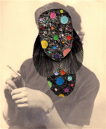
While I was in Newcastle the other weekend I had chance
to go to the Baltic. They're starting to get ready for the Turner Prize so there weren't many exhibitions but there was however a small collection of work by Maurizio Anzeri that caught my attention.
I'd come across his work before but not in real life. I hadn't realised how small the pieces are. It makes them strangely personal and intimate.
His art seems to bring together a couple of fascinations we have within our society and media. Firstly, through his use of found vintage photographs, our obsession with the past; our constant nostalgia for times that seem alien to the world we live in, seen in the vintage style clothes we wear and the period dramas we watch. And secondly, being drawn to things that we find unnerving and that frighten us.

The pieces, although very beautifully threaded and designed, are very unnerving. I think it's an instinctual fear; an obscured face is frightening to us. You can't read it or recognise it's features so it takes on a creature-like and monstrous appearance. But also comic, espeically in the complete juxtaposition between the often sophisticated poses and the obscure tribalesque pattern imprinted over the top.
At first I thought his art was about the way we read and interpret faces but after reading the interview I've linked to below, I've realised the concept is much more poignant and poetic. It's about the loss of identity which will happen to all of us one day. Even without their faces covered, they would still be unidentifiable.
Here's a quick sketch I did whilst in the gallery. It was interesting drawing directly from the pieces because of the different lines and shapes that now makes up the portrait.
Subscribe to:
Posts (Atom)